We dissect the wisdom of Darren Palmer, star of Channel 9 series The Block, from his design talks at the Home Show.
Not many people know that Darren, before the glitz and the glamour, used to be a graphic designer, in spite of his love for home interiors. He believed this expression was only possible through a six-year architecture course and low paid internships. He ditched his job after listening to stories from his friends, who would speak passionately about their careers. Riddled with two mortgages, he decided to renovate his home to sell it. The results, as you can imagine, were breathtaking. With the help of rugby star Neil Whittaker (a friend of a friend), he managed to get his renovation published in Bell Magazine.
Fast forward to now, Darren is an ambassador for Hafele Home, after ‘frothing over this product’ in his book. Hafele provides hardware, fitted systems and electronic access control solutions for modern living.
Throughout his talks, blogs and books, Darren always stresses that the public now has a higher education of aesthetics,
“Compare the show we ran in 2008 as design professionals vs what normal people are doing now on the Block, it’s because they’ve seen 13 seasons of The Block.”

Darren Palmer’s 8 Kitchen Design Fundamentals
Kitchen Triangle
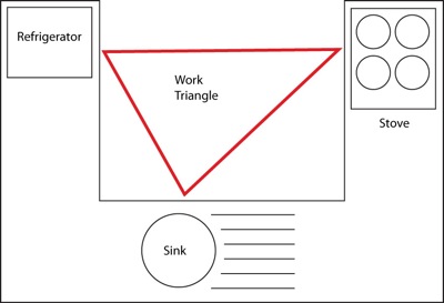
Ahh, the beloved kitchen design triangle. Many people have seen the strange shapes mapped onto kitchen floor plans, connecting the stove to the sink to the fridge. Strict rules that dictate ‘may no traffic pass through this area’ is enforced in modern kitchens. What most people don’t realise is that the rule was enacted in the 1940s, when handmaids weren’t just a tale and the second world war was well underway.
Darren has a new philosophy that relates to our bigger, more social kitchens 80 years later. He calls it ‘zoning’ where each zone serves a purpose. The fives zones are consumables (food), non-consumables (plates), cleaning, prep and waste. Rather than penalise people for walking through an invisible triangle, this rule opens up space and invites everyone to use the kitchen in their own way. Only one rule is set in stone; surfaces should be at least 1.3 meters wide.
We have entered a period of contemporary design — a period of self-expression where two solutions don’t need to look the same. Whether it’s Hamptons style crossed with Victorian themes, you are liberated to express your personality in so many ways.
Darren sums this up, “Design periods used to follow the time a monarch was in power and they would last for decades. And then they got shorter and shorter and shorter. And now we live in this contemporary period where everything isn’t sideways, it’s on top of each other and you have access to all the different periods all at once.”

Joinery as Sculpture
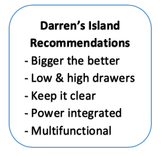
 Undoubtedly, there’s one BIG feature that everyone wants in their new kitchen. You guessed it, island benches. They have taken the home interior world by storm and transformed our kitchen spaces into living, breathing hubs for family and friends. With the rise of multigenerational living, the kitchen island has become a space where we can all happily co-exist.
By the same token, appliances have become design statements in the kitchen. Vintage fridges and stoves have become the centrepiece. If you are going to take this approach, Darren says you should link it back to something else. Got a stainless-steel fridge? Use stainless steel door handles in the surrounding area or risk having it stick out like a sore thumb.
Darren is a huge advocate for integrated design – like dishwashers built into cabinets (mandatory). “I love everything that’s James Bond, which opens and shuts and reveals things in surprising and interesting ways,” he remarked.

Overcapitalising
What is overcapitalising? Put simply, it’s spending more than you’ll make back. For example, butlers’ pantries are just as trendy as kitchen islands these days. But they are not absolute or mandatory. Ask yourself: do I have space? Will I use it? Is it a priority? Is it more important to have a pantry or island bench? Be honest with yourself and don’t just follow the latest design trend. Don’t force something that’s not functional, self-assess and prioritise the things that add livability and hide day-to-day clutter.
Darren put it bluntly, “When anybody asks me about trends, generally speaking, I say 1) I don’t care and 2) the biggest trend I see is individuality. People are making their own decisions based on their own aesthetic choices. Their own style, their own needs, what they’ve seen on their travels.”
Nevertheless, it can be difficult sometimes. We are bombarded with new appliances for the kitchen every day. Steam ovens, induction microwaves, barista coffee makers, blenders and slow cookers – the list goes on… If you have the resources and the space to own all these gadgets, good for you. But most of us need to prioritise and not overcapitalise.
“There is no ‘lick and stick solution’ to design. There is no handbook that says this is always going to be right, this is always going to be wrong; what’s more important is assessment.” Darren starts to sound like a personal trainer; instead of shedding weight, we’re shedding wants.

The Big Mistake
Darren says that when people watch The Block, they often get confused about seemingly contradicting advice. That’s because people want absolute rules and don’t realise one size doesn’t fit all (is there a metaphor building here?). He stresses that there is no ‘handbook’ when it comes to design.
Where’s the fun in copying ideas from The Block anyway? This is your chance to get creative, to splash your personal flair into your home. It’s also a good time to get real; assess all the requirements, what your families need, the haves and have-nots. Throw this all into a detailed brief and you might actually keep within budget. (good luck!)
Darren navigates the pitfalls of modern mistakes, “The big mistake in this season [of The Block] is when the contestant hasn’t thought about how they’re going to use it when it’s done. Planning your whole kitchen without knowing where your bin goes. It sounds like such a simple thing, but in a high-end kitchen, you’re not going off to Howards Storage World and grab a Brabantia bin and just stick it in the corner, because it ruins the design of your house.”
One example of a big mistake is renovating a kitchen to accommodate just one fridge. Sure, you were single when you made that decision. But did you plan on meeting someone? Having kids? Having mum move back in? The next buyer? We rarely see what’s coming, so let’s accommodate for best (or worst) case scenarios.

Finish
Let us finish with a story from the honourable Darren Palmer: “There was a day many many years ago where I thought handles were hideous and they detracted from the design of a kitchen. Now I see them like earrings of a beautiful face. You go into the effort of buying a nice dress, spending money on the shoes, but you don’t neglect the earrings. It’s exactly the same as kitchen handles.”
Handles are a subtle way to add style to your home without offending future buyers because they can always change them easily. Whether it’s contemporary or traditional, handles or no handles, you can’t go wrong.
Darren admits that his Anthracite (coal) sink is his favourite part of this home. After all the pastels we saw years ago, metallic finishes are now a big deal. However, due to the intensity, you have to be careful about how they are mixed. Don’t mix brass with gold, for example. Champagne silver is the new frontier now, a sandy light gold colour that shouts femininity.
If you are planning on living somewhere for a long time, then go wild with the colours. A kitchen finish needs to be refreshed every ten years anyway, so experiment with your wildest instincts and see where that takes you. Tiles, like wallpaper, give you the tools to really jazz things up. The only colours to avoid in the kitchen are red and blue, which biologically shuts down appetite, a reflex from our cavemen ancestors.
