9-11 October 2026
International Convention Centre Sydney

The New Language of Home: Interior Design Trends Shaping 2026 and Beyond

Something shifted this year. Walk through any of the world's great design shows and you feel it before you can articulate it. The clinical white box is gone. So is the relentless pursuit of less. In its place: warmth. Texture. The quiet confidence of a home that has nothing to prove and everything to say.

From the grand halls of Milan's Salone del Mobile to forecasts emerging from studios across Australia, interior design in 2026 is telling a new story. One defined not by rules, but by resonance.

Here is what the world's most influential design events are telling us about the spaces we will be living in next.
What the World's Design Shows Are Saying
Milan Salone del Mobile 2026: Bold Statements and Material Honesty

Every April, Milan becomes the global capital of taste. The message from the fairgrounds at Rho Fiera Milano was unambiguous: interiors are becoming more expressive, more sculptural, and more emotionally engaged.

Lacquer made a striking return, appearing not just on cabinetry but woven into the structure of sofas and armchairs. Where we once sought softness in upholstery, designers at Tacchini, Frigerio, and beyond introduced lacquered elements that added precision and elegance to seating. Structure is back in fashion.

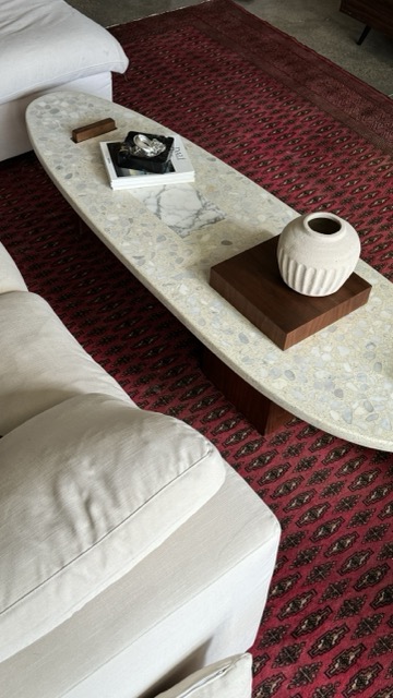
The sculptural table was everywhere. Statement dining pieces with unexpected silhouettes, intricate joinery, and material contrasts dominated rooms that once deferred to the sofa. The table is no longer secondary.

Natural stone remained central, but with a new energy. Marble is appearing with more expressive veining, in unexpected colour ranges: deep orange tones, saturated greens, rich warm whites. The era of the restrained beige slab is giving way to something with more character.

Perhaps most tellingly, the mood at Milan moved decisively away from safe beige. Colour arrived with conviction. Muted tangerine, terracotta, and warm ochre dominated palette choices, while some exhibitors pushed further into jewel tones and primary jolts. Alessi transformed a Milan palazzo into a world of giant red and yellow pillars. Hermès brought vivid orange, vermilion, and saffron. The message was clear: colour used thoughtfully is never excess.

Collectible and craft design also made a significant push to the mainstream, with the inaugural Salone Raritas bringing together nearly 30 galleries of limited edition and high-end craft. As curator Annalisa Rosso noted, “Everyone is looking for something unique and rare to add value to their interior design. It’s no longer only collectors, but architects, buyers and developers.”

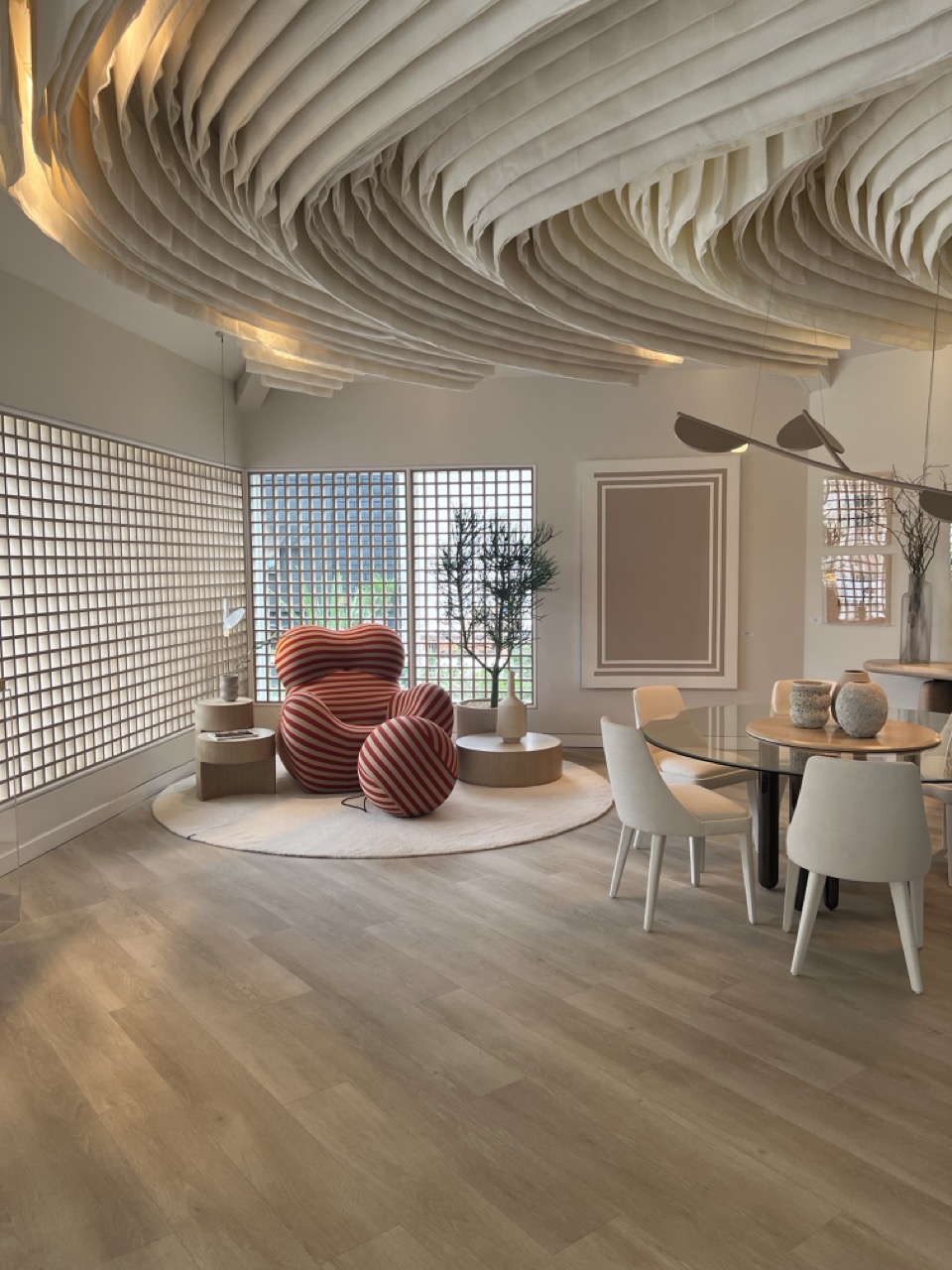
Softness returned in a different form too. After years of spare, polished surfaces, tactile richness dominated: embroidery, appliqué, patchwork, quilting, handloom weaving, and dense pile textiles. These are surfaces made to be touched. Interiors are becoming sensory experiences, not just visual ones.

The Trends Defining 2026 and 2027

1. Warm Minimalism: The End of the Cold White Box

The stark white interior, the one that looked better on Instagram than it did to live in, is officially over.

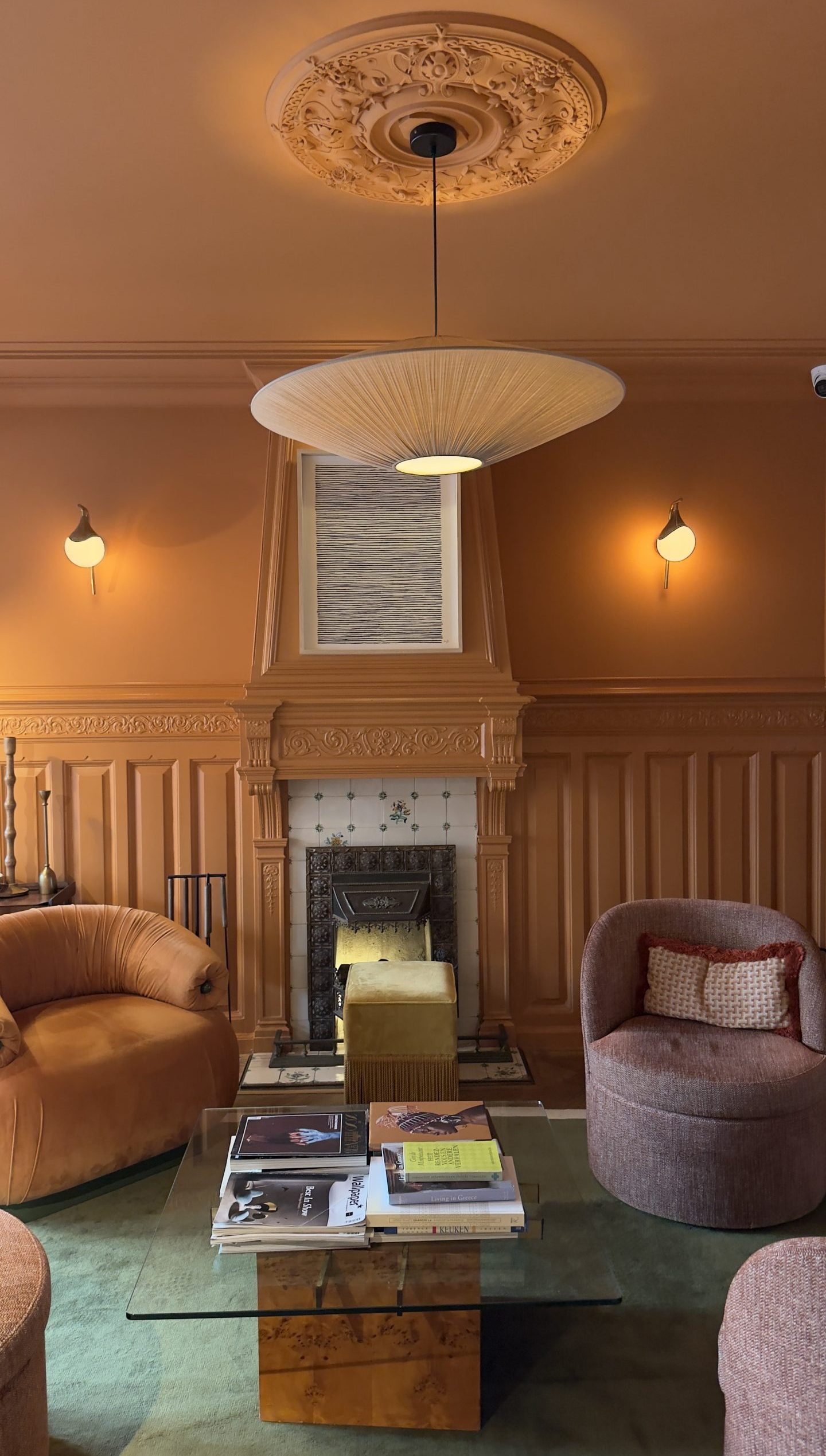
In its place: warm minimalism. Think oatmeal, terracotta, soft sage, and creamy beige. Colour drenching, the practice of applying the same tone to walls, skirtings, and ceiling, is gaining traction as a way to create what designers are calling a “cocoon effect”. Fewer visual breaks. More psychological shelter.

Pantone’s surprise 2026 Colour of the Year, Cloud Dancer, a soft billowy white, reflects this too. The institute described it as “a calming influence in a frenetic society discovering the value of quiet reflection.” It is not the cold white of years past. It is quieter. More intentional. A canvas rather than a statement.

What this looks like at home: Tonal layering across a single room, limewash or textured render on walls, timber tones warming the floors, linen drapes pooling at the window.

2. Texture as Architecture

If 2024 was about form and 2025 was about colour, 2026 is the year of touch.

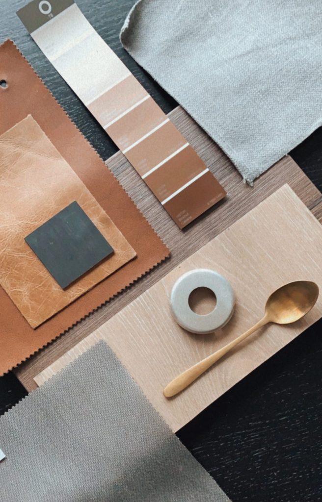
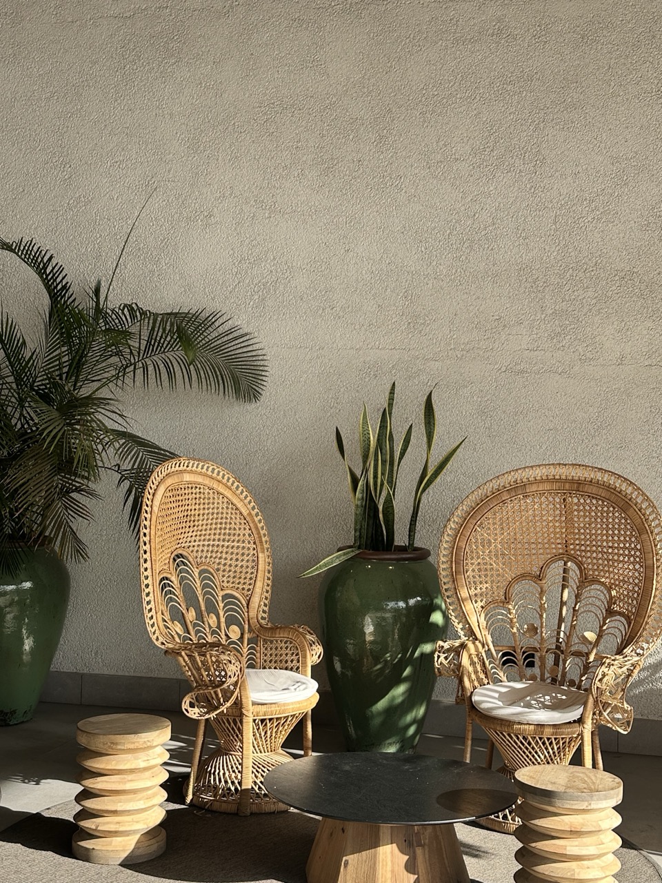
Texture has moved from finishing detail to foundation. Designers are layering velvet, cork, wool, rattan, linen, and woven textiles within the same space, building rooms that feel genuinely lived-in. Hand-painted walls, honed stone tiles, and natural timber with visible grain are replacing the polished and the perfect.

This is closely linked to a broader movement toward material authenticity. At Milan and in forecasts globally, manufacturers are celebrating raw textures, visible machining marks, and imperfections rather than hiding them. Bronze, brass, and brushed gold are replacing chrome. Stone is chosen for its variance, not its uniformity.

What this looks like at home: A travertine splashback with visible fossils, a handmade ceramic bowl that bears the imprint of the potter’s hands, a sofa upholstered in a fabric that gets better with age.

3. The 1970s Revival (Done Beautifully)

The 70s are back. Not in costume, but in spirit.

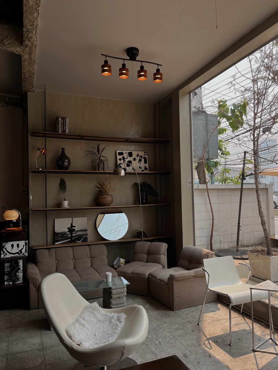
Warm midtone timbers. Glass bricks. Lacquer. Chrome and nickel. Conversation pits. Mosaic tiling. Low-slung furniture with deep cushions. Australian designers are describing it as “all the spaces look like they were made for a very cool party.” The appeal is understandable: unlike Parisian or Mediterranean styles that depend on pre-existing architectural conditions, 70s-influenced interiors are achievable in most Australian homes. The palette and the styling do the work.

At Milan, this manifested in heritage brand archives being reopened and reinterpreted. Familiar forms in updated finishes. Knoll reissued the MR chair in a rust-toned powder coat. Cassina brought back the Bruno chair in a blue chrome frame. The conversation pit appeared across multiple showrooms, reimagined as modular, curved seating designed for connection.

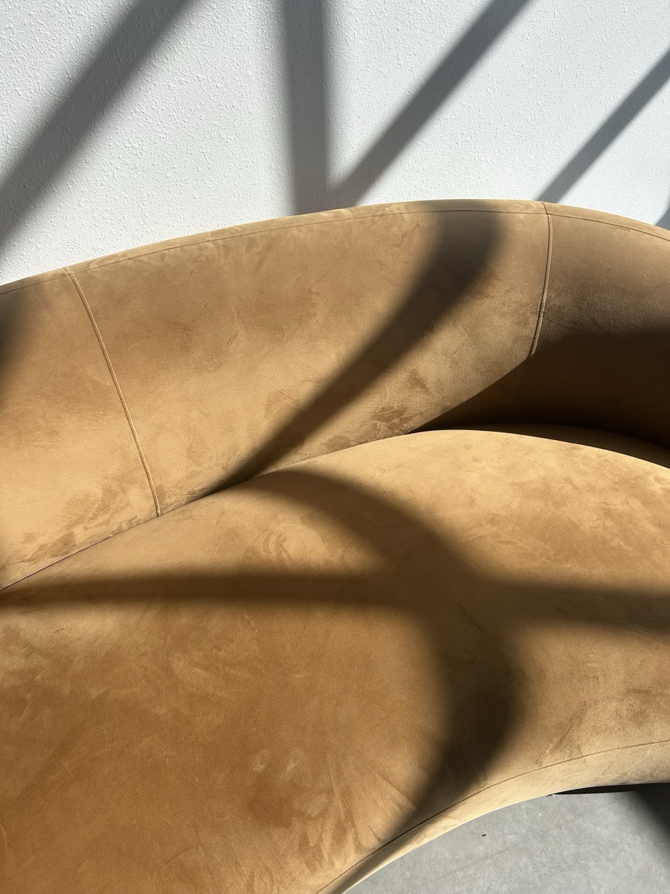
What this looks like at home: A curved statement sofa in warm caramel leather, a mosaic-tiled bathroom, statement pendant lighting, low shelving with curated objects.

4. Colour With Conviction

After years in which colour had to justify its presence in a room, 2026 has given it permission to simply exist.

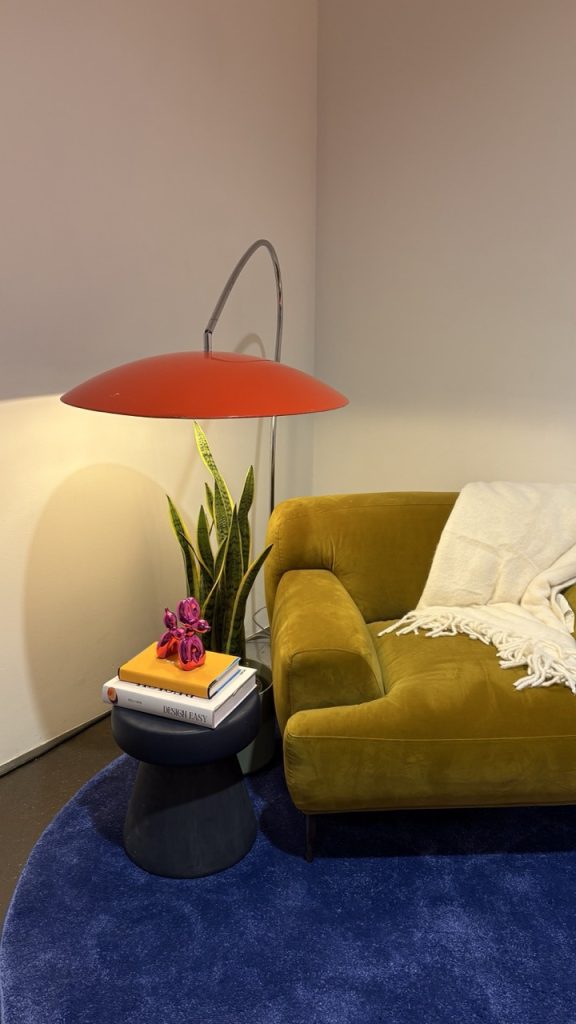
Earthy and warm tones dominate: deep terracotta, mocha, rich chocolate brown, warm olive, and apricot. Jewel tones are appearing in bedrooms and bathrooms, in what designers are calling “jewel box” rooms where a fully saturated colour palette can feel intimate rather than overwhelming. Deep burgundy, emerald, and teal are replacing the cautious pastels of earlier years.

Colour is also being used architecturally. Drenching a room in a single shade, including the ceiling and joinery, transforms it into an experience rather than just a painted space. This is colour as emotional infrastructure.

The Dulux 2026 Colour Forecast reflects this, with Misty Grape leading a palette that signals a pivot toward hues that feel personal, grounding, and mood-altering, rather than backdrop-neutral.

What this looks like at home: A bedroom drenched in deep olive, skirting to ceiling. A powder room in moody terracotta with brass fixtures. A kitchen island painted in a shade that no one else on your street has.

5. Curated Eclecticism: Personal Over Perfect

The showroom aesthetic is losing ground to something more considered and more honest.

Curated eclecticism is not maximalism. It is not about more. It is about meaning. Spaces that layer vintage finds with contemporary pieces, inherited objects with new investments, global textiles with local craft. The unifying principle is not a style but a sensibility.

Australian designers are calling this out explicitly. The home of 2026 is one that feels like the people who live in it, not like a catalogue page. Heirlooms sit alongside contemporary lighting. Reclaimed timber meets refined metal. Antique wood shares a room with considered new purchases.

Sustainability is woven into this trend naturally. The mantra is buy less, buy better. Vintage and preloved furniture is having a moment across Facebook Marketplace, auction houses, and specialist dealers. Pieces that patina and age are preferred over fast-fashion furnishings.

What this looks like at home: A gallery wall that mixes original art with found objects. A dining chair collection that does not match, but coheres. A sideboard passed down that grounds an otherwise contemporary room.

6. The Biophilic Home Grows Up

Biophilic design has been with us for several years now. In 2026, it evolves from a single fiddle leaf fig in a corner to something more considered and immersive.

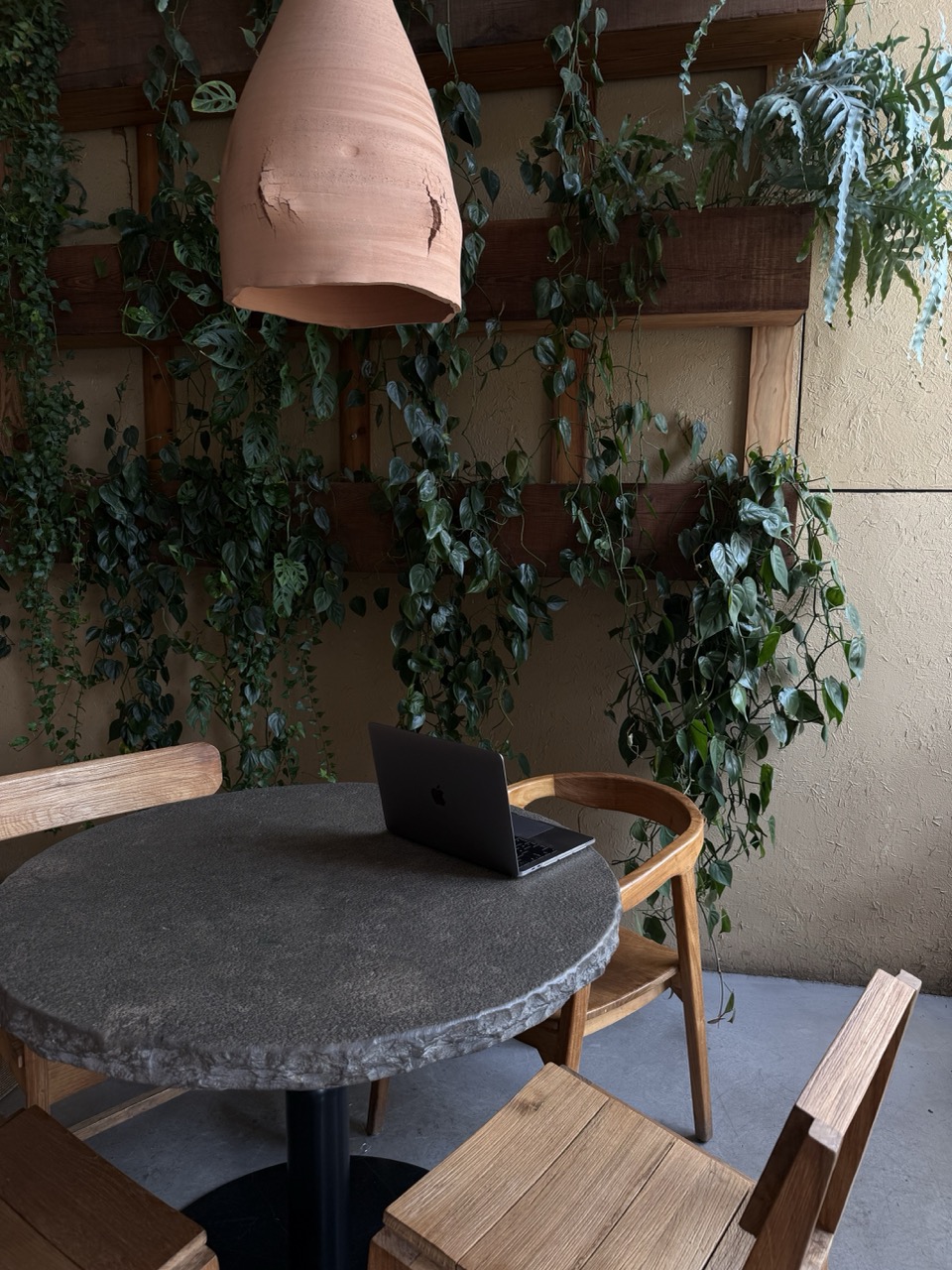
Living walls, water features, moss panels, and integrated planters are appearing in high-end residential projects. Circadian lighting systems that adjust throughout the day to support sleep and energy levels are moving from commercial buildings into homes. Materials that connect to the natural world, reclaimed timber, natural stone, rattan, organic textiles, are chosen not just for their aesthetic but for the emotional ease they create.

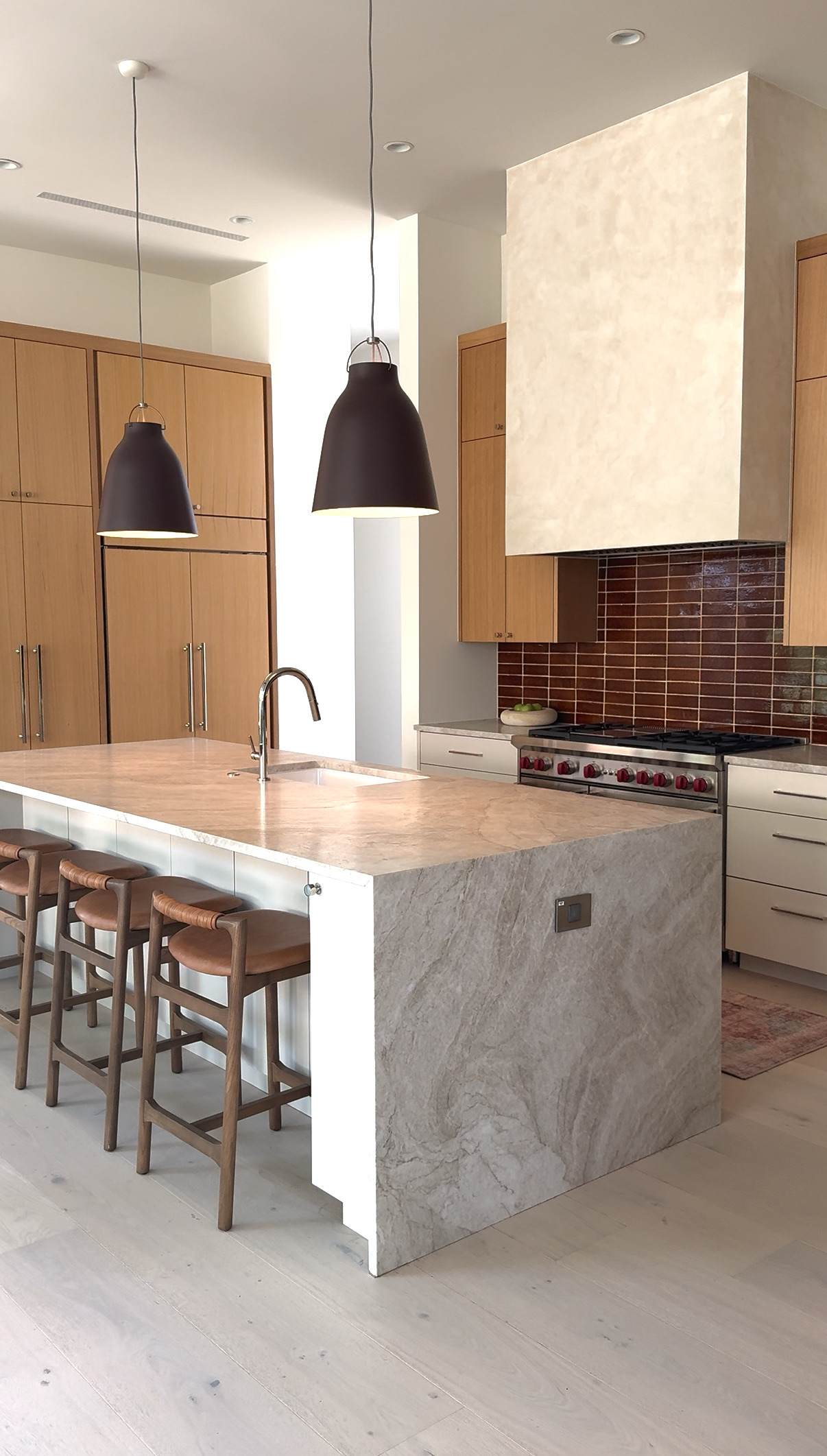
In kitchen design particularly, the boundary between inside and outside is dissolving. Large-format glazing, flush thresholds, and outdoor furniture that is indistinguishable from indoor collections are defining a new approach to how Australians live with their gardens.

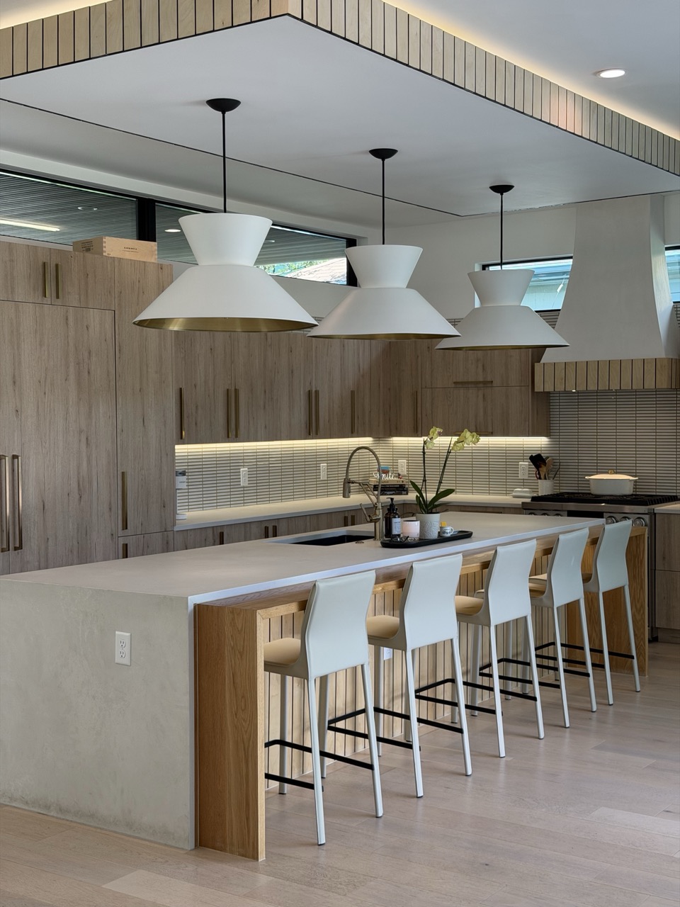
What this looks like at home: A kitchen that opens to a garden through full-height glazed doors. Integrated planting in the kitchen or bathroom. Timber joinery chosen for its grain, not its uniformity. Natural stone benchtops with visible character.

7. Multifunctionality and the Purposeful Room

The pandemic-era scramble to make every room do everything is settling into something more deliberate.

Modular systems, concealed storage, adaptable living solutions, and hidden workspaces are defining a new approach to home design that maximises usability without sacrificing beauty. Slide-in door systems, integrated joinery that hides the home office, and rooms designed with clear social or functional identities are replacing the shapeless, multi-purpose space.

Interestingly, the dedicated dining room, long considered a casualty of open-plan living, is making a quiet comeback. Designers are arguing for spaces that have a defined purpose and emotional identity, rather than rooms that serve every function equally and none of them well.

What this looks like at home: A dining room designed for daily use, not special occasions. A study that conceals entirely within a run of joinery. A living room that flows to the outdoors but retains its own character.

What Is Quietly Disappearing

Every trend forward is also a trend away from something. In 2026, that means:

The modern farmhouse aesthetic is winding down. Neutral jute rugs paired with white shiplap have had their moment. The over-curated, everything-matches styling that defined the mid-2010s is giving way to something less coordinated and more alive. Cold grey palettes are receding in favour of warmth. And fast, disposable décor is losing ground to the longer view.

Locally, Australian designers are responding to these global signals with a particular kind of intelligence.

The emphasis on material quality, authenticity, and longevity resonates deeply in a market where homeowners are thinking in decades rather than trends. The shift toward warm, earthy palettes aligns with the natural light conditions and building materials common across Australian homes. And the growing appetite for biophilic design reflects a culture that has always understood the value of bringing the outdoors in.

The overriding theme from Melbourne to Sydney to Brisbane is this: the era of designing for a hypothetical future buyer is over. The home of 2026 is designed for the people who actually live in it. And that, more than any specific colour or material, is the most significant shift of all.